My Featured
Projects

A Dutch-based sustainable skincare brand known for its ocean-safe products, minimalist aesthetic, and strong environmental commitment.
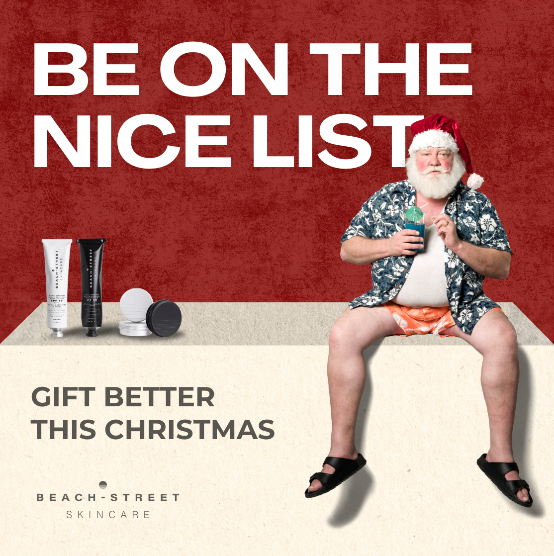
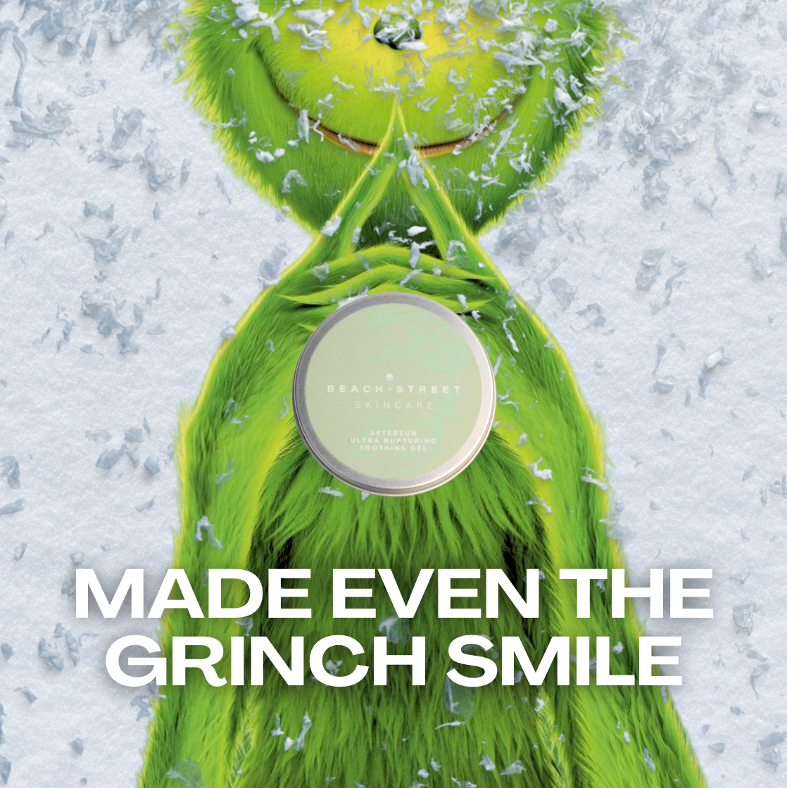
Beach-Street Skincare Christmas Campaign
A playful holiday concept featuring a beach-ready Santa that increased add-to-carts by 67% and lifted conversions by 36%. The creative direction blended humor with Beach-Street’s coastal identity, giving the brand a fresh competitive edge during the holiday season.
Description
Overview
For Beach-Street’s Christmas season, I developed a humorous and visually distinctive campaign featuring a relaxed, tropical Santa dressed in beachwear. The aim was to introduce a festive message that stood out in a crowded holiday market while staying true to Beach-Street’s ocean-inspired identity.
The Challenge
Christmas is one of the most competitive advertising periods of the year. Brands across every category release seasonal creatives at the same time, making it difficult for smaller brands to differentiate themselves. Beach-Street needed a holiday campaign that felt original, on-brand, and strong enough to compete for attention.
The challenge was to balance festive energy with the brand’s minimalist, beach-driven aesthetic and maintain authenticity without blending into typical holiday advertising.
My Approach
I created a playful concept centered on a “holiday-on-the-beach” Santa to instantly capture attention and evoke emotion. By dressing Santa in tropical attire, the campaign maintained the warmth of Christmas while reinforcing Beach-Street’s coastal story.
I led the visual layout, messaging, and art direction, keeping the composition clean and product-forward while using humor to connect with audiences.
Results
The campaign performed strongly across targeted metrics, driving a 67% increase in add-to-carts and a 36% lift in conversions throughout the Christmas period. Audiences responded positively to the humor and originality of the concept, giving Beach-Street a creative edge during a highly competitive seasonal cycle and strengthening the brand’s visual identity.
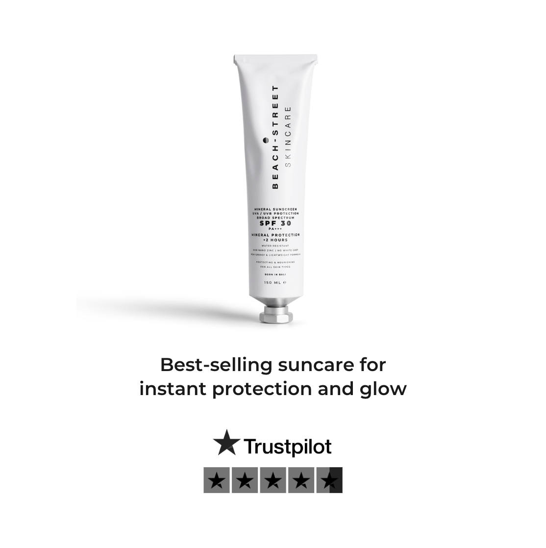
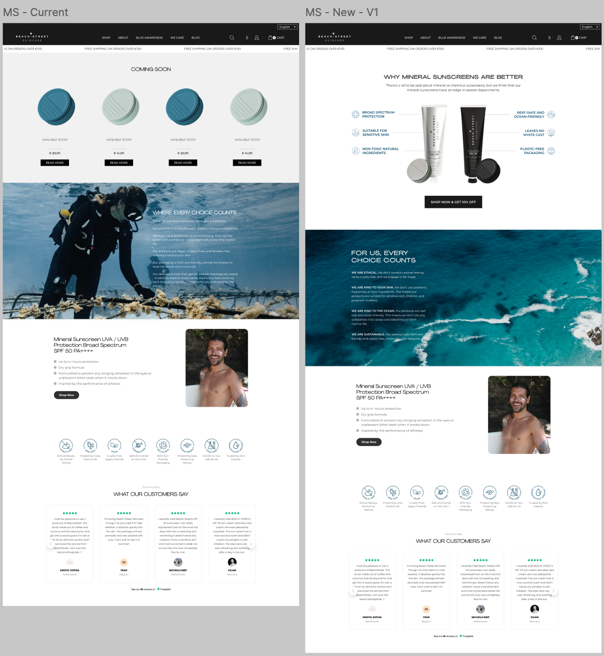
Beach-Street Email Campaign Redesign
A high-performing email design built to replace outdated templates with a clear story flow, strong product education, and conversion-focused layout. This redesign significantly improved engagement and supported multiple product push campaigns.
Description
Overview
I designed a new email campaign layout for Beach-Street to replace previous newsletter styles that lacked structure, clarity, and conversion flow. The goal was to create a modern, elevated template that could communicate product benefits effectively, reinforce brand identity, and drive sales for specific product pushes.
This new design became the standard for several campaigns, including versions for our mineral sunscreen (hero product).
The Challenge
The existing email templates did not communicate the product’s value or narrative in a clear way. Important information was hidden, the visual flow felt disjointed, and the call-to-action was not emphasized.
We needed an email design that:
• holds attention
• educates quickly
• tells a compelling story
• showcases ingredients and benefits
• builds credibility
• drives conversions
• and supports ongoing promotional campaigns
The challenge was creating a layout that balanced education, emotion, and clear CTAs while staying true to Beach-Street’s clean, ocean-inspired aesthetic.
My Approach
I conceptualized and designed a completely new email format built around a structured storytelling path.
Key enhancements I introduced:
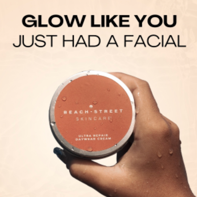
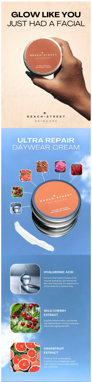
• A strong, benefit-led hero section (“Glow Like You Just Had a Facial”) to immediately hook readers
• Ingredient spotlight modules with clean visuals and concise copy to educate without overwhelming
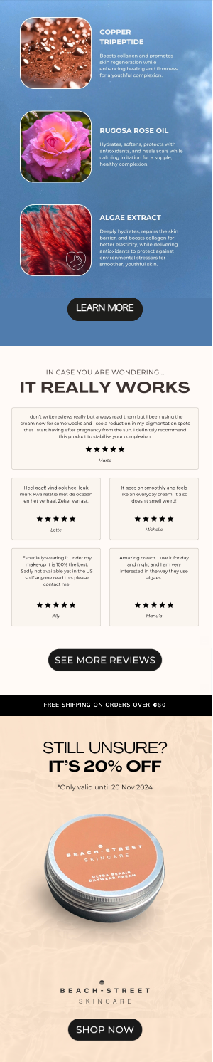
• High-quality lifestyle imagery to create emotional connection and brand affinity
• Testimonial section placed strategically to reinforce trust at mid-scroll
• Clear CTAs throughout the email to guide purchase decisions
• A timed incentive near the end to lift last-minute conversions
• Brand-consistent textures, color palette, and typography to modernize the visual identity
• Logical flow from awareness → education → proof → offer → purchase
This layout was designed with mobile behavior in mind since the majority of Beach-Street’s audience opens emails on smartphones.
Results
The redesigned email outperformed previous formats across multiple metrics and became the preferred structure for future product campaigns.
Performance highlights:
• Higher open-to-click conversion
• Noticeable improvement in time spent reading
• Increased click-through rate
• Stronger add-to-cart behavior compared to older templates
• Positive internal feedback from both the marketing and PR teams
• Effective for product push campaigns, including sunscreen, where variations of this design were reused
The visual clarity, modern structure, and benefit-driven flow helped the brand communicate product value in a way that felt premium, trustworthy, and easy to digest.
Additional Note
Although this example showcases a different product, the same strategic framework and visual approach were applied to sunscreen variations, each adapted based on campaign goals and seasonal focus.
Description
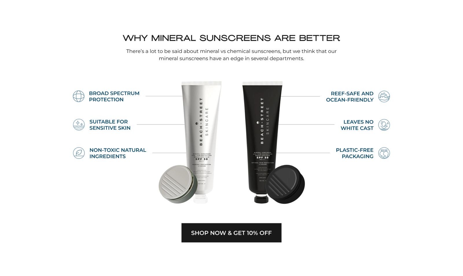
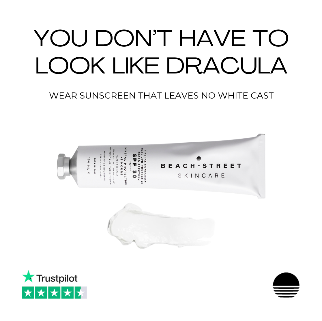
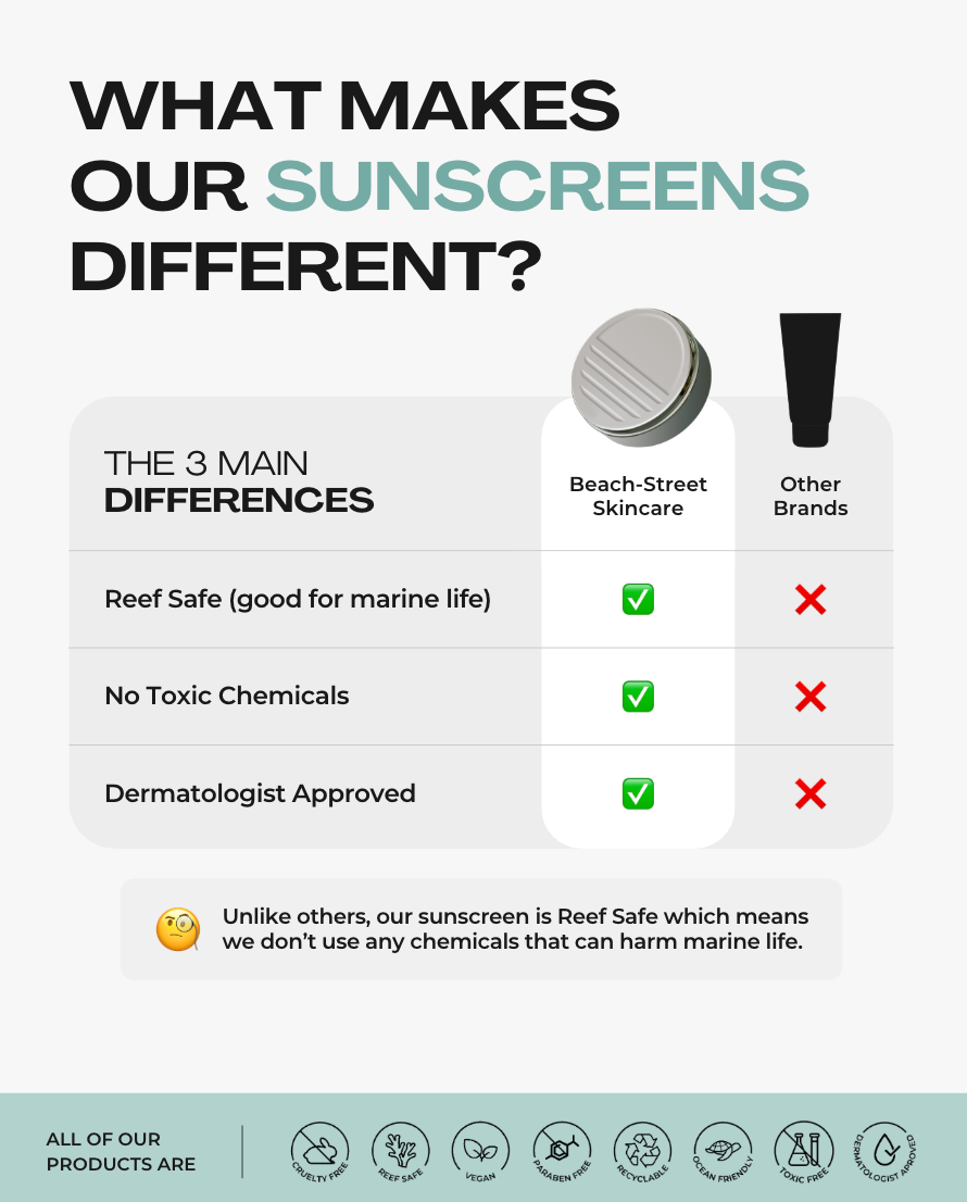
Beach-Street Sunscreen Landing Page
A high-converting landing page built from scratch specifically for paid advertising funnels. Designed to
educate quickly, hold attention, and convert ad traffic by highlighting Beach-Street’s ocean-safe and fully sustainable sunscreen.
Description
Funnel Strategy, Landing Page Creation, UX Direction, Messaging, Conversion Optimization
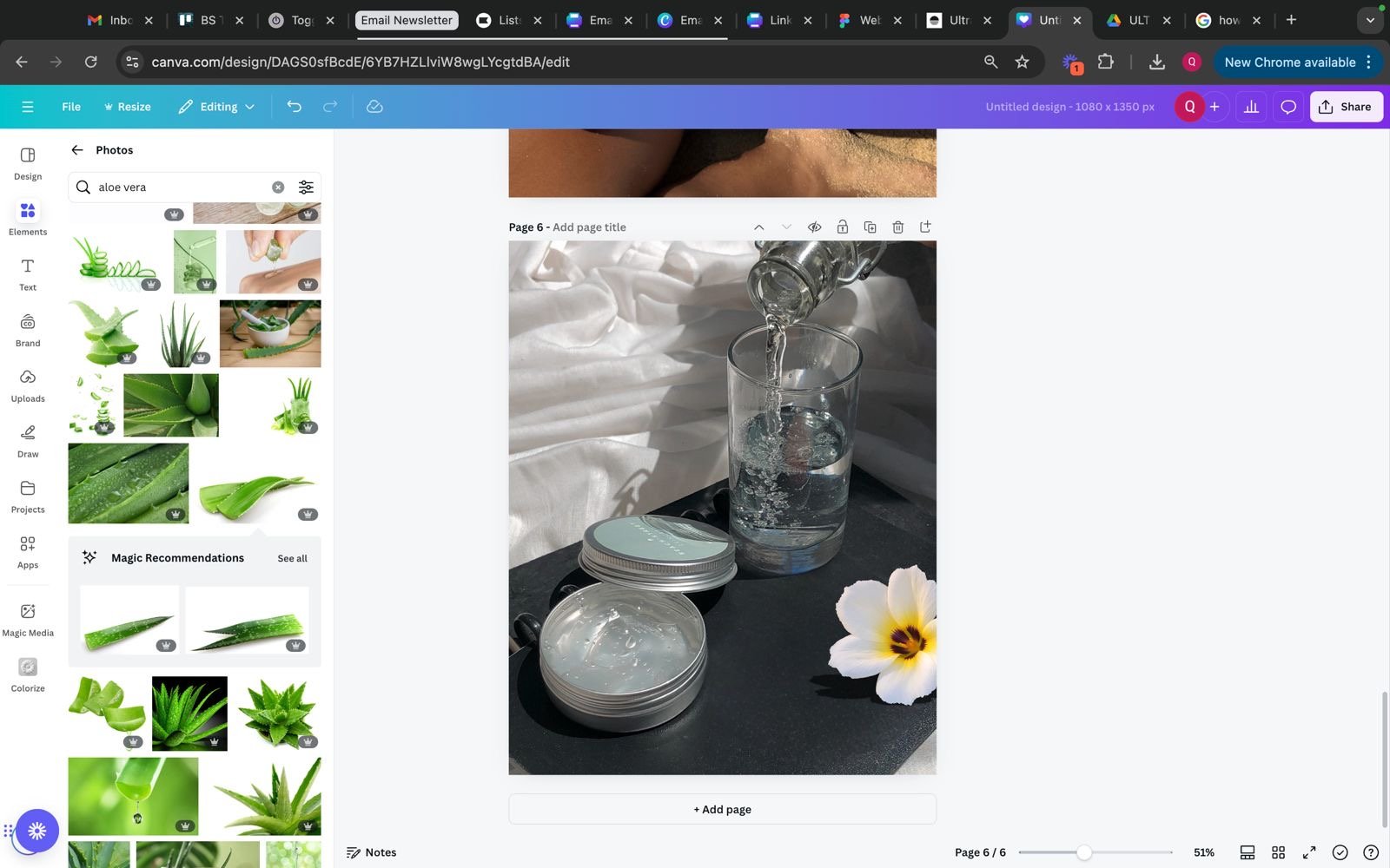
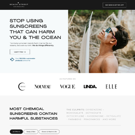
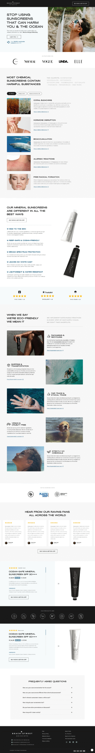
Overview
I directed a new landing page for Beach-Street’s mineral sunscreen that served as the primary destination for paid advertising funnels. The page was designed to convert cold and warm ad traffic by explaining the ocean-safe difference quickly and clearly, while establishing trust through strong sustainability storytelling.
The Challenge
Paid ads drive fast but fragmented traffic. Users often decide within seconds whether to stay, scroll, or leave. The challenge was to create a landing page that captured interest immediately, educated efficiently, and guided visitors toward purchase without overwhelming them.
The page had to support performance metrics crucial to advertising such as conversion rate, add-to-cart behavior, scroll depth, and bounce rate.
My Approach
I built the landing page entirely from scratch with a conversion-first structure tailored for ad traffic. The content hierarchy was crafted around how users consume information when entering through paid ads: fast, visual, benefit-led.
Key elements I conceptualized include:
• A problem-solution hero section addressing chemical sunscreen harm and introducing the ocean-safe alternative
• Quick, visual ingredient comparisons to simplify complex topics for fast-scrolling users
• A benefits-first product breakdown emphasizing performance, usability, and formulation safety
• Strong trust signals including press mentions, reviews, certifications, and conservation partners
• Sustainability-led storytelling grounded in Beach-Street’s 100 percent sustainable process
• Lifestyle visuals connecting the product to athletes, divers, surfers, and eco-conscious consumers
• Repeated CTAs to support conversion across different intent levels
• Ad-friendly UX with fast load time, clean layout, and minimal friction
Description
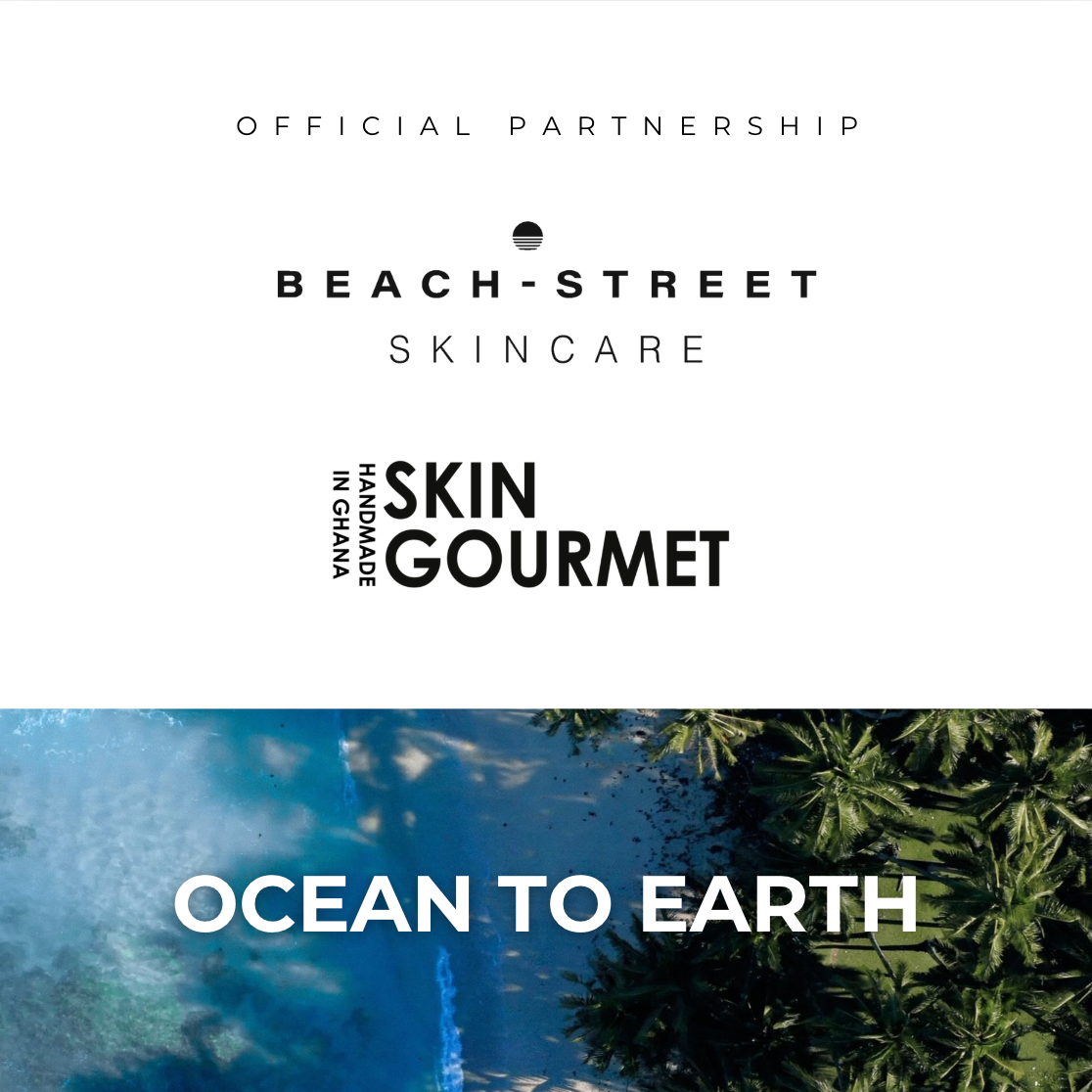
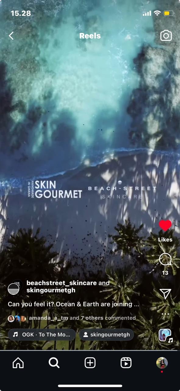
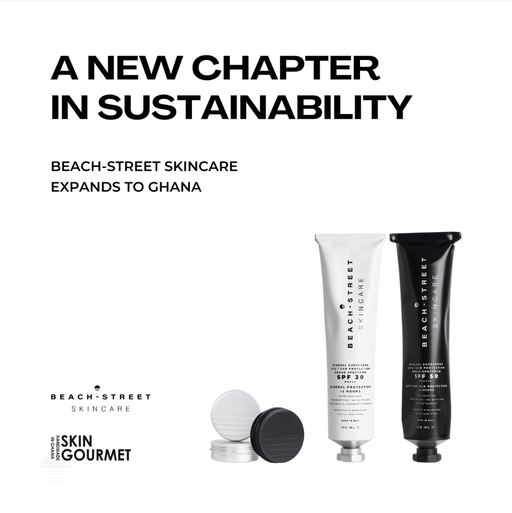
Ocean to Earth Partnership Announcement Post
A key visual within the Ocean to Earth Campaign introducing Beach-Street’s partnership with Skin Gourmet. The announcement post generated strong engagement and helped pave the way for a distributor relationship that opened new market access in Africa.
Description
Context
This visual served as the official partnership announcement post within the broader Ocean to Earth Campaign, created to introduce Beach-Street’s collaboration with Skin Gourmet. The purpose of this piece was to communicate the partnership clearly, visually align both brands, and inspire early audience interest.
The Challenge
Partnership announcement posts are easy to overlook if they lack a strong concept and clear meaning. The challenge was to design a visual that felt intentional, branded, and engaging enough to encourage audiences to participate in the story behind the collaboration, not just scroll past it.
My Approach
I designed the visual to emphasize simplicity, balance, and shared brand identity. By combining clean typography, a unified layout, and the campaign theme “Ocean to Earth,” the post communicated credibility and purpose.
The messaging was crafted to highlight collaboration, authenticity, and global connection, setting the tone for the rest of the campaign rollout.
Results
This announcement post became one of the strongest-performing pieces within the Ocean to Earth Campaign. It generated high interest, strong engagement, and meaningful audience traction. The response helped support deeper conversations between the two brands and contributed to Skin Gourmet becoming Beach-Street’s distributor, opening a strategic new market in Africa.
Additional Note
Separate to this, we had established partnership with Sea Shepherd, Plastic Soup Foundation and Coral Gardeners.
Description

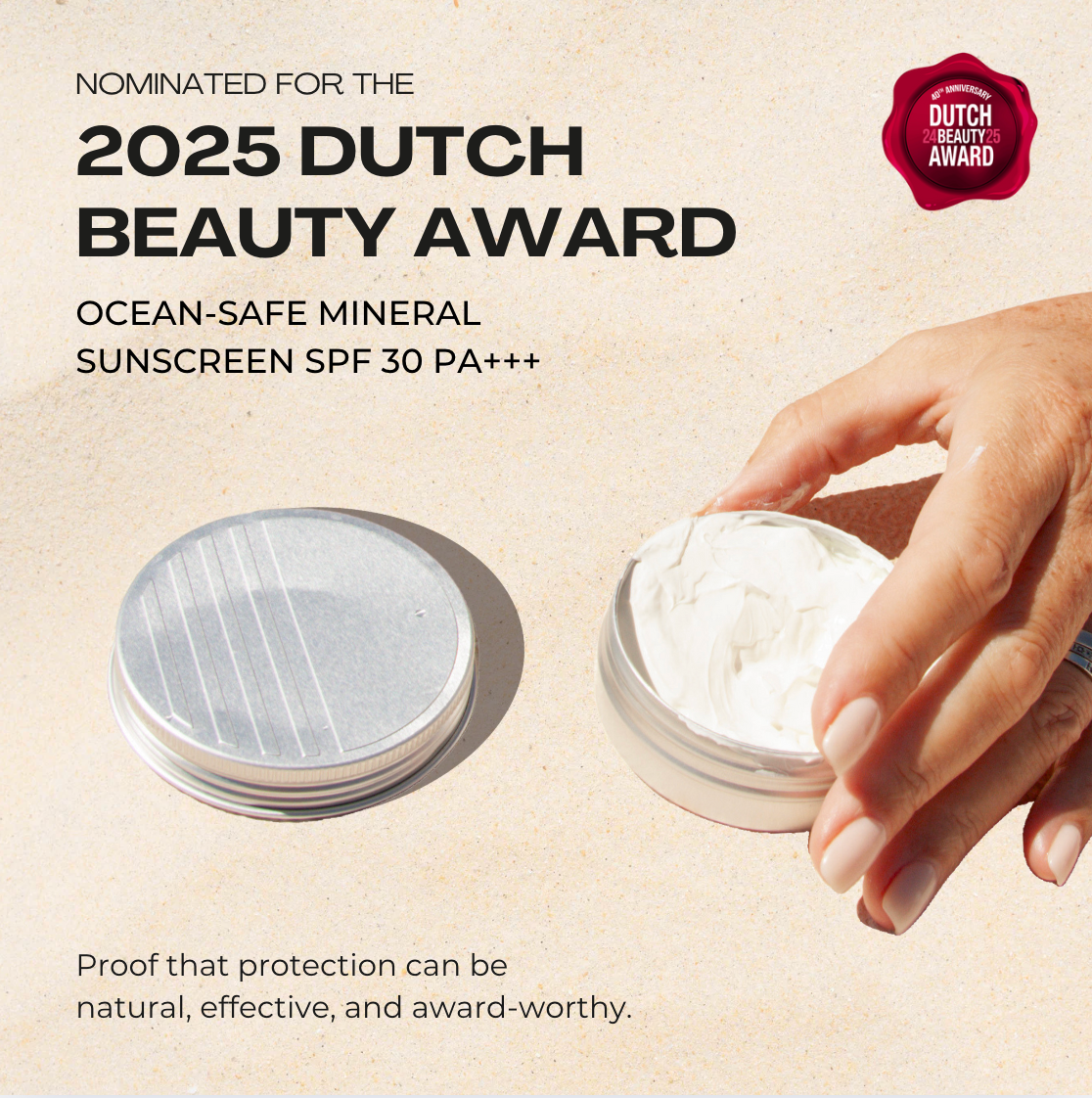
Dutch Beauty Award Nomination Announcement
A sustainability-driven PR announcement visual highlighting Beach-Street’s award-nominated, ocean-safe sunscreen. I worked with the PR team to align press materials, reinforce our end-to-end sustainability messaging, and execute a rollout that strengthened brand credibility among eco-minded consumers, athletes, and marine conservation communities.
Description
Overview
Beach-Street’s hero sunscreen was nominated for the 2025 Dutch Beauty Award, recognizing its performance, safety, and innovation. As a brand built on 100 percent sustainable, end-to-end practices and ocean-safe formulations, the nomination aligned perfectly with our core values and our audience of sports enthusiasts, ocean lovers, and sustainability-driven consumers.
The Challenge
Awards announcements often get lost in the noise unless the story behind the recognition is communicated with intention. We needed a visual and message that showcased not only the award nomination itself but also the deeper brand values that made the product deserving of recognition.
The challenge was creating an asset that elevated credibility, reflected our sustainability promise, and stayed consistent with the brand’s natural, minimalist aesthetic.
My Approach
I designed a clean, editorial announcement visual featuring natural textures, soft lighting, and the sunscreen’s distinctive ocean-safe formulation. The visual tone highlighted purity, effectiveness, and eco-consciousness without overwhelming the audience.
I also supported the PR team by:
• ensuring the press release emphasized sustainability and ocean-safe credentials
• aligning the media kit, product copy, and social captions for consistency
• framing the nomination as validation of our environmental commitment and scientific performance
• shaping messaging that resonated with athletes, divers, marine advocates, and eco-driven customers
The communication strategy presented the award as both a product achievement and a milestone in ethical, sustainable beauty.
Results
The announcement strengthened Beach-Street’s brand authority and credibility within eco-conscious markets. It supported PR outreach across media channels, generated strong social engagement, and reinforced the sunscreen’s position as a leading ocean-safe option among conservation communities and active, outdoor-driven consumers. It also contributed to higher interest from sustainability-aligned partners and retailers.
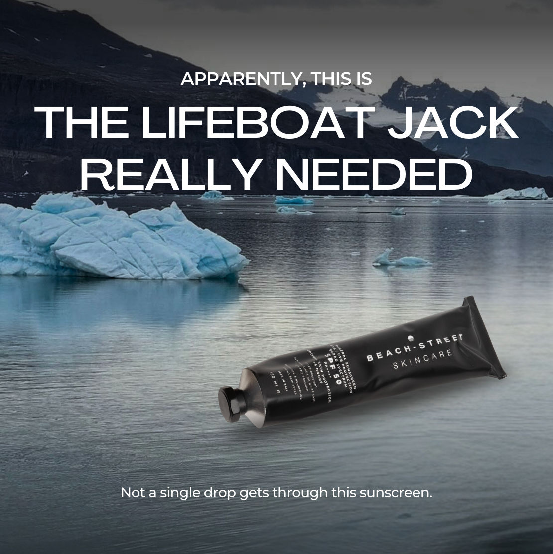
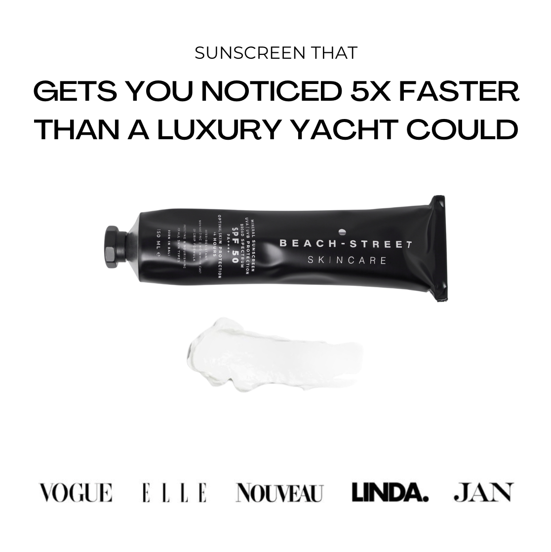
Beach-Street Persona-Based Ad Variations
Two strategic ad variations designed to highlight different selling points of our ocean-safe sunscreen, each crafted for a distinct audience persona. One targeted beauty-focused consumers seeking luxury and credibility. The other appealed to active, fun-loving, outdoors-driven customers with humor and strength-focused messaging. Both supported our hero product conversion goals and delivered strong performance across regions.
Description
Overview
I developed two creative ad variations for Beach-Street’s hero sunscreen to better understand how different audience personas responded to our product’s core selling points. Instead of traditional A/B testing, this approach focused on persona-led creative differentiation, allowing us to tailor messaging to the motivations of two distinct customer segments.
The Challenge
Beach-Street’s audience includes two very different buyer groups.
1. Beauty-forward consumers who prioritize aesthetics, credibility, and premium skincare feel.
2. Active lifestyle users such as surfers, runners, divers, and ocean lovers who value strength, durability, and personality in a product.
The challenge was identifying which message and tone would convert better without diluting brand consistency or confusing ad learning phases.
We had a clear goal: increase conversions and push our hero product to meet internal sales targets through targeted paid campaigns.
My Approach
I conceptualized and designed two fully distinct ad angles, each anchored in a different product benefit and emotional driver.
Ad Concept 1: High-end beauty appeal
• Clean, editorial-inspired design
• Highlights product texture, quality, and credibility
• Supported by beauty magazine recognition
• Tailored for premium skincare buyers who trust minimalist, luxury-style visuals
• Messaging focused on “being noticed” and high-performance skin protection
Ad Concept 2: Humor and durability for active users
• Fun, memorable creative using a Titanic-inspired hook
• Highlights formulation strength with the line “Not a single drop gets through this sunscreen”
• Designed for sport lovers, ocean adventurers, and outdoors-driven personas
• Leverages humor to immediately capture attention and drive curiosity clicks
Both versions were produced in various ad placements, but the 1:1 format is shown here as an example for documentation.
Results
Each ad performed strongly with its intended persona group.
Beauty persona:
• Higher conversion rate
• Better engagement in high-income regions
• Stronger appeal among premium skincare shoppers
Active persona:
• Higher click-through rates
• Stronger add-to-cart behavior
• Increased leads from outdoor, sports, and marine-conscious audiences
Together, the ads expanded our reach, improved persona-level insights, and supported sales of the hero product by delivering message–audience fit across multiple regions
Description

A New Zealand–Australia business coaching and consulting company that helps builders scale, systemize, and grow profitable construction businesses through events, workshops, and programs.
")
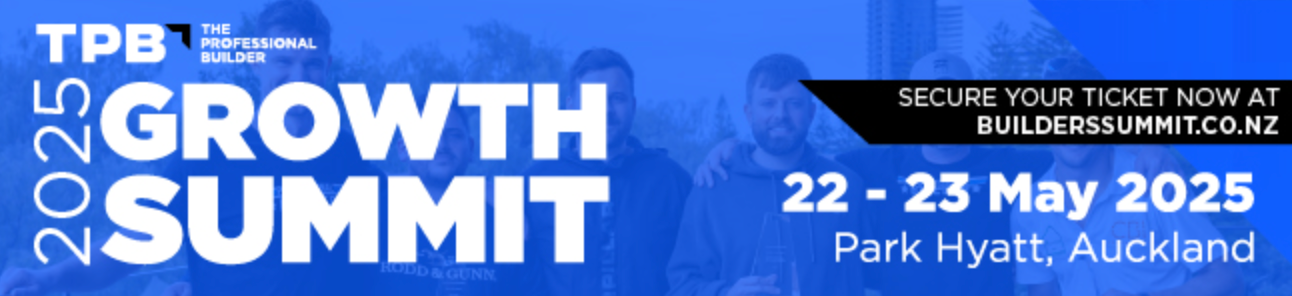
TPB Event Banner Revamp
A visual overhaul of The Professional Builder’s event banners used across social media, email promotions, and workshop announcements. The redesign improved clarity, hierarchy, and brand consistency, resulting in stronger visibility and more professional, high-impact event communications.
Description
Visual Direction, Event Marketing Design, Brand Communication
Overview
I redesigned the promotional banners for The Professional Builder’s events, including the 2025 Growth Summit and multiple live workshops. These assets were used across email campaigns, social promotions, and registration pages. The goal was to create a more modern, cohesive, and effective visual identity that reflected the scale and professionalism of TPB’s events.
The Challenge
The original banners lacked clarity and strong visual hierarchy. Important information such as dates, sponsorships, speakers, and CTAs were not emphasized, and the overall layout felt crowded and difficult to scan.
Because these banners are often viewed quickly — in emails, ads, and social feeds — they needed to be instantly readable and visually aligned with TPB’s brand.
My Approach
I redesigned the banners with a cleaner, more structured layout that made the content easier to digest and significantly more professional.
Key improvements included:
• Clear headline hierarchy so viewers instantly understand the event title and value
• Stronger brand alignment using consistent TPB colors, typography, and graphic shapes
• Improved CTA placement to drive faster action on platforms like email and Facebook
• Modern and minimal layout that looks credible and high-impact
• Balanced composition with speaker imagery placed strategically to draw attention
• High-contrast typography for better readability on both desktop and mobile
• Flexible variations that could be adapted for different platforms and sizes
The result was a polished and cohesive set of promotional assets suitable for both large-scale summits and smaller workshop events.
Results
The revamped banners helped TPB achieve stronger communication clarity and improved visibility across digital channels. The updated visuals supported event marketing efforts, increased professionalism in customer-facing materials, and made all event promotions feel more aligned with TPB’s brand direction.
These banners were later used as baseline templates for future events due to their effectiveness and visual clarity.
Description
Before :
After :

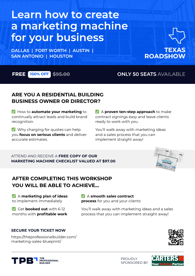
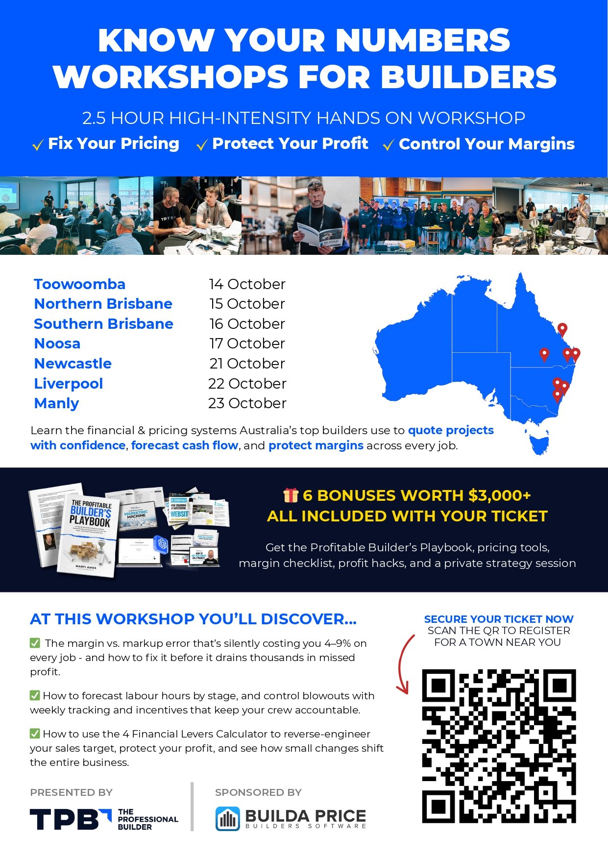
TPB Workshop Flyers for Australia and Texas Roadshow
Two tailored flyer designs created for different regional audiences. Each version highlights event value, aligns with local priorities, and supports A/B-style testing for clarity, engagement, and sign-ups across Australia and the United States.
Description
Audience Segmentation, Visual Design, Messaging Strategy, Event Marketing
Overview
I designed two regional flyers for The Professional Builder to promote their high-intensity workshops in Australia and the United States. The goal was to create clear, persuasive event communications that matched each region’s audience profile while maintaining strong brand consistency.
The Challenge
Two different regions meant two very different audiences:
Australia: Builders needing financial clarity, pricing confidence, and margin control.
Texas (USA): Builders looking for marketing automation, lead generation, and stronger client processes.
The challenge was to communicate each event’s value in a way that felt culturally aligned, easy to scan, and conversion-ready. At the same time, we needed a format that allowed TPB to test which messaging and layout styles performed best with each regional group.
My Approach
I designed two flyers, each intentionally structured around the core needs and motivations of the intended audience.
Australia Flyer – “Know Your Numbers Workshop”
Strategic focus: financial systems, margins, cash flow, and accurate quoting
Key design and messaging choices:
• A bold headline focusing on financial clarity
• A tour-style layout showing multiple workshop stops across Australia
• Strong educational language emphasizing pricing, forecasting, and cost control
• A map visual to improve regional relevance
• Clear CTA using a QR code for fast registration
This flyer was built to appeal to builders who want practical financial tools and systems they can implement immediately.
Strategic focus: marketing automation, sales systems, and brand growth
Key design and messaging choices:
• Headline centered on creating a “marketing machine” for predictable business growth
• Location-specific callouts (Dallas, Fort Worth, Austin, San Antonio, Houston)
• Clear breakdown of outcomes: marketing plan, sales contract process, lead generation
• Strong incentive messaging (100% off, limited seats)
• Free checklist offer to increase sign-ups and perceived value
This version appealed to American builders prioritizing client acquisition, branding, and business development.
Results
Both flyers performed strongly within their target regions and supported TPB’s wider event marketing objectives. The variations allowed TPB to identify which messages, visuals, and structures resonated best with specific audiences, improving event sign-ups and engagement.
Together, these designs strengthened TPB’s event communication strategy and provided reusable templates for future workshop series and roadshows.
Description

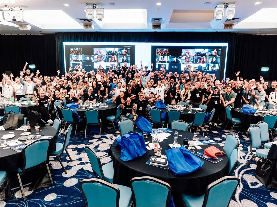
TPB Gold Coast Summit 2025 – End-to-End Event Management & Marketing
Full-spectrum event coordination and marketing for TPB’s largest summit ever. Managed logistics, communication flows, promotional assets, and on-ground operations, contributing to a 9.2 rating and 194+ attendees.
Description
End-to-End Event Coordination, Marketing Strategy, Communications, and Operations Support
Overview
I played a key role in managing the end-to-end coordination and marketing of TPB’s Gold Coast Summit 2025. This two-day event became TPB’s largest in company history, hosting over 194 builders, business owners, and industry partners. The summit achieved a 9.2 satisfaction rating and delivered an energetic, high-value experience grounded in practical learning and community connection.
The Challenge
Managing an event of this scale requires seamless coordination between marketing, logistics, venue teams, internal departments, speakers, and attendees.
Key challenges included:
• delivering clear, consistent communications before and during the event
• coordinating logistics across multiple stakeholders
• ensuring the venue, technology, and attendee flow ran smoothly
• producing high-impact promotional materials
• aligning messaging across email, social, and internal platforms
• maintaining energy, clarity, and structure in a fast-moving environment
The goal was to make the entire journey — from first announcement to event day execution — feel smooth, professional, and inspiring.
My Approach
I contributed across the full event life cycle, combining both marketing and logistical coordination.
1. Events Marketing
• Created promotional graphics for Instagram, email, and paid channels
• Designed announcement posts that highlighted date, location, and urgency
• Wrote and structured communication materials to boost registrations
• Maintained brand consistency through all pre-event assets
2. Event Logistics & Operations
• Coordinated attendee flow, check-ins, seating, and workshop transitions
• Supported operational planning to ensure sessions ran on schedule
• Worked with the venue, media team, and internal staff for seamless execution
• Helped manage the atmosphere in the room and maintain high engagement
3. Attendee Communications & Experience Design
• Managed and refined instructions, reminders, and touchpoints
• Ensured participants received clear directions and updates
• Assisted with day-of communication between teams, speakers, and staff
4. Brand Presence & Event Identity
• Ensured consistency across banners, screens, print materials, and stage visuals
• Strengthened the summit’s overall brand identity and event professionalism
Results
The Gold Coast Summit became TPB’s most successful event to date.
Key achievements:
• 194+ attendees — highest in TPB summit history
• 9.2 satisfaction rating based on post-event surveys
• Strong engagement and positive attendee feedback
• Smooth execution with minimal delays or friction
• High-energy environment across both days
• Clearer communication, stronger branding, and more cohesive attendee experience
This project demonstrated my ability to manage events holistically, combining operational coordination with strategic communication and high-quality marketing execution.
Description
 – After")
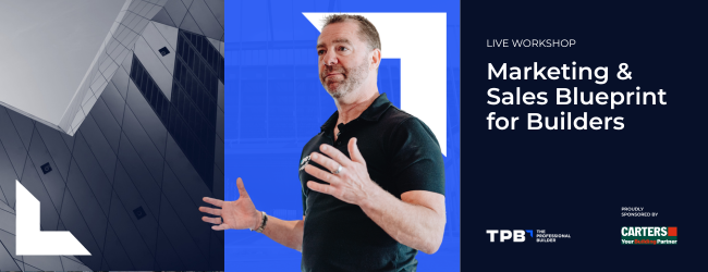
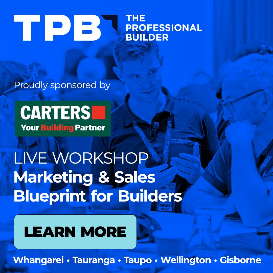
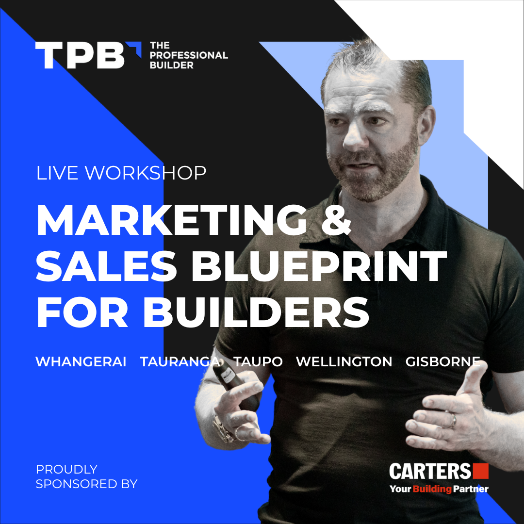
Social Media Announcement Redesign – TPB Workshops
A redesign of TPB’s workshop promotional posts to improve readability, hierarchy, and brand presence. The updated design strengthened clarity, modernized the visual identity, and performed better across social channels.
Description
Visual Design, Brand Alignment, Messaging Strategy, Event Marketing Communications
Overview
I redesigned the promotional social media graphics for TPB’s “Marketing & Sales Blueprint for Builders” workshop. The goal was to elevate clarity, improve the user’s instant understanding of the event, and ensure the visuals matched TPB’s brand identity and the professionalism of their workshops.
The Challenge
The original social post was functional but lacked a strong visual hierarchy. Important information was dispersed across the layout, the sponsorship logo overpowered the messaging, and the overall design did not fully reflect the professionalism or value of the workshop.
Because social posts are consumed fast and often on mobile, the challenge was to create a design that:
• communicates the key message in under 2 seconds
• looks professional and consistent with TPB’s visual identity
• centers the speaker and the workshop value
• maintains sponsor visibility without overtaking the message
• is scalable for multiple workshop dates and cities
My Approach
I created a cleaner, bolder, and more structured design that presents information clearly and highlights the workshop’s core value.
Key improvements included:
• Stronger headline hierarchy with the workshop title front and center
• Cleaner grid layout for better readability on mobile
• Improved brand consistency using TPB’s blue, monochrome elements, and geometric shapes
• Balanced sponsor placement that remains visible without overshadowing the content
• High-quality speaker imagery to increase trust and authority
• Modern visual style that feels aligned with corporate and events branding
• Clearer list of cities, styled to be easy to scan
The updated design is more engaging, more professional, and more aligned with TPB’s brand reputation.
Results
The redesigned graphic performed significantly better across social platforms and improved engagement around TPB’s workshop promotions.
It helped strengthen brand consistency, present information more clearly, and support conversions for workshop registrations.
Description
Before :
After :
A premium wellness brand specializing in high-quality traditional, infrared, and hybrid saunas for health-conscious consumers across the United States.

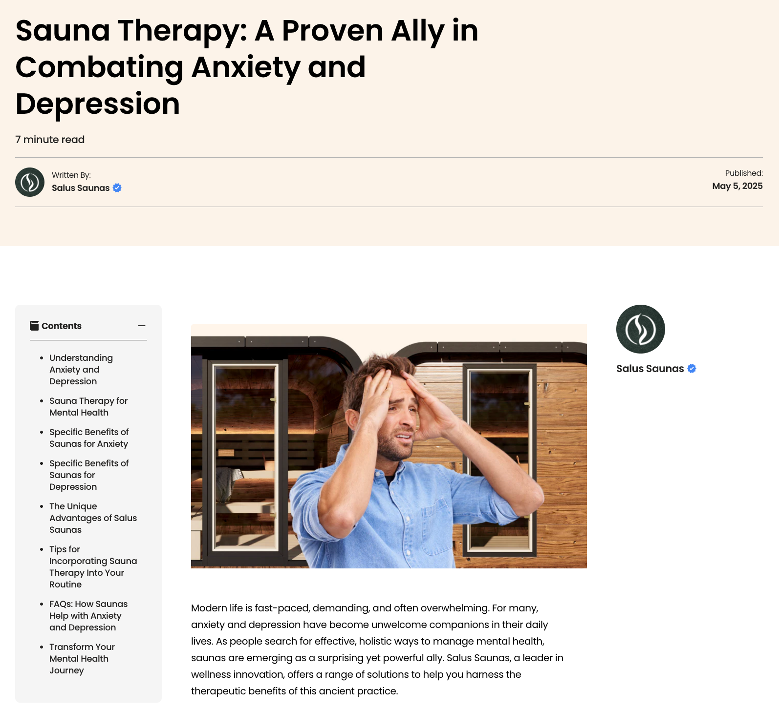
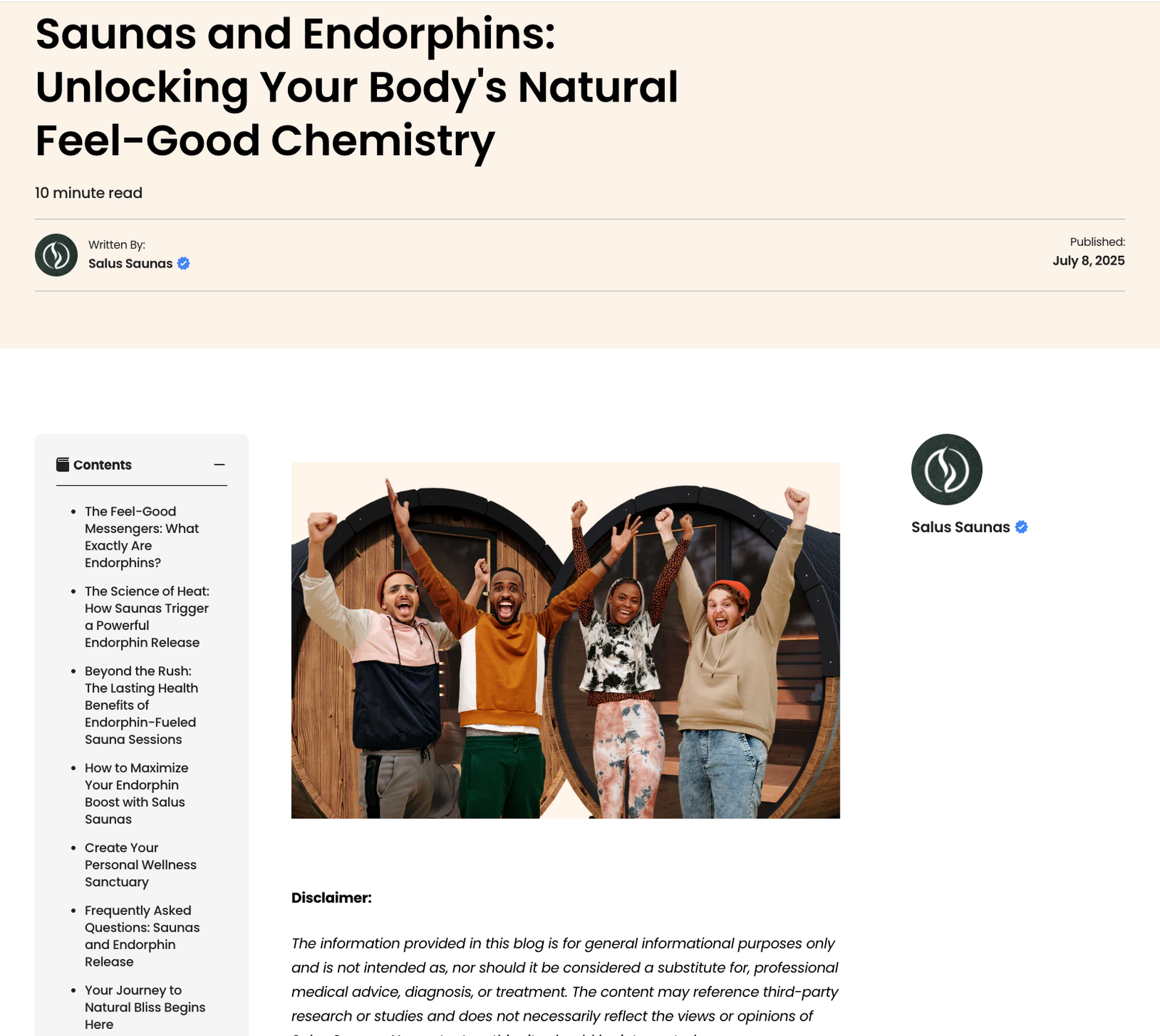
Salus Saunas – SEO Blog Strategy & Content Development
Revamped the brand’s blog strategy by transforming inconsistent, low-quality posts into structured, research-backed, SEO-optimized articles. Improved credibility, content flow, and search performance, resulting in multiple first-page keyword rankings.
Description
Overview
I helped elevate Salus Saunas’ blog content by introducing a clear editorial structure, SEO-focused strategy, and research-backed writing style. My role included proofreading, rewriting, restructuring, and advising on content direction to improve the brand’s authority, credibility, and organic visibility.
The Challenge
Before this initiative, the blog lacked professionalism and consistency. Posts were often:
• informal and unstructured
• missing scientific credibility
• visually inconsistent
• published irregularly
• lacking proper linking and keyword targeting
• written in a style that felt more like rough notes than polished content
This limited the brand’s reach, SEO potential, credibility, and ability to capture high-intent organic traffic.
My Approach
1. Introducing a Scientific, Evidence-Based Style (among other strategies)
I recommended and implemented a content style focused on:
• research-backed explanations
• responsible wellness claims
• references to studies and expert insights
• well-structured benefits and breakdowns
• content that educates and builds trust
This shift positioned Salus Saunas as a serious wellness authority instead of a lifestyle brand posting casual tips.
2. Building an SEO-Driven Editorial Framework
• Identified target keywords using search intent and competitive analysis
• Restructured articles with proper H1, H2, H3 formats
• Ensured keyword placement and density were optimized
• Added internal linking to improve navigation and site health
• Expanded articles to improve dwell time and completeness
• Improved thumbnails and preview content for higher click-through
3. Editing & Rewriting Content for Quality
• Proofread and corrected grammar, tone, flow, and clarity
• Rephrased paragraphs for user understanding and readability
• Added depth, examples, and supporting research
• Ensured brand consistency across all long-form posts
4. Aligning Content With Audience Intent
• Balanced scientific explanations with easy-to-understand language
• Tailored content for wellness-focused readers seeking actionable knowledge
• Positioned articles so they led naturally toward product exploration
Results
The revised content strategy produced measurable improvements:
• multiple blogs ranked on the first page of Google for targeted sauna keywords
• noticeable increase in organic traffic and time-on-page
• stronger brand credibility, especially among wellness and health-focused readers
• more organic leads entering the funnel through educational content
• a structured editorial system that the brand could reuse
This project demonstrated my ability to elevate an underperforming content ecosystem into a credible, SEO-aligned resource that drives organic growth and positions the brand as a trusted authority.
Description

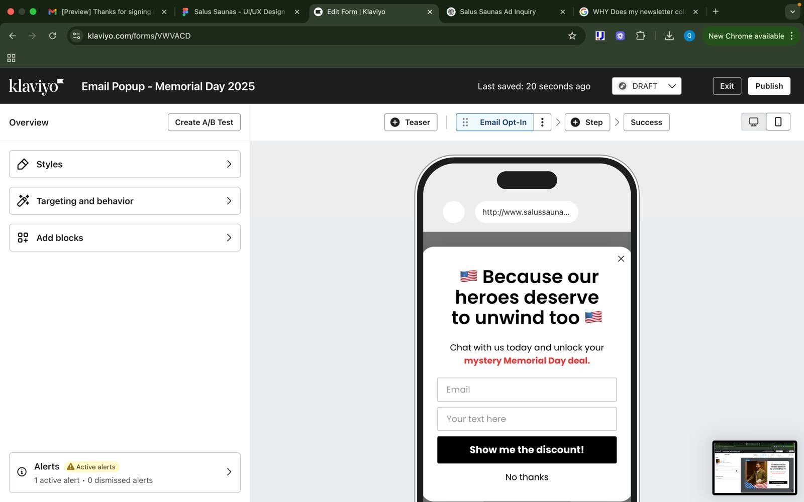
Salus Saunas – Email Marketing
Designed and launched Salus Saunas’ first official email marketing asset in Klaviyo. Built segmented audience lists, developed content strategy, and created a high-performing layout focused on clarity, credibility, and conversion.
Description
Overview
This was the first structured email marketing asset I created for Salus Saunas using Klaviyo. I handled the segmentation, strategy, content, and design to build a high-performing email that introduced the brand, guided customers through trust-building, and encouraged product exploration.
The Challenge
Before this, Salus Saunas did not have a cohesive email marketing structure. The goal was to create a foundational asset that:
• makes a strong first impression
• builds credibility through real testimonials
• showcases product categories clearly
• encourages direct engagement
• sets the tone for future automated flows (welcome, browsing, etc.)
The email needed to feel premium, warm, and easy to navigate for customers at different stages of the funnel.
My Approach
1. Klaviyo Segmentation & Setup
• Created segmented lists based on behavior, browsing history, and funnel position
• Set groundwork for future flows and customer journey automations
2. Content Strategy & Copywriting
• Wrote a warm welcome message that matched the brand’s wellness tone
• Highlighted credible testimonials from well-known public figures
• Structured the narrative as trust → education → product discovery → action
• Added clear CTAs designed to drive replies, questions, and sales conversations
3. Design & Layout
• Designed a clean, modern visual layout that reflects Salus Saunas’ premium identity
• Built product category blocks (“Shop by Sauna Type”) to help customers self-select
• Ensured mobile-first readability with logical spacing and scanning patterns
• Formed a base template for future email campaigns
4. Messaging Cohesion
• Balanced warmth with clarity
• Ensured consistent tone across all sections
• Included supporting resources such as FAQs, blogs, and contact links to guide exploration
Results
The email delivered strong performance as the company’s first cohesive marketing message:
• boosted click-through and engagement
• increased category exploration on the website
• generated more direct inquiries and discount requests
• became the foundation for future email campaigns and flows
This project showcased my ability to build structured, persuasive email communications from scratch — blending strategy, design, and brand storytelling.
Additional Note
Alongside email marketing, I also supported affiliate marketing operations through Social Snowball, UpPromote, and Upfluence — managing onboarding, communication, performance tracking, and alignment with brand campaigns.

Salus Saunas – Influencer and High-Profile Partnership Discovery Call
Conducted a professional discovery call with a globally recognized supermodel and former Victoria’s Secret Angel, along with her publicist and team. This showcases the standard partnership process I manage with high-net-worth clients, influencers, and public figures at Salus Saunas.
Description
Influencer Relations, Talent Communication, Partnership Alignment, Brand Representation
Overview
As part of Salus Saunas’ influencer and partnership program, I conducted a discovery call with a globally recognized Brazilian supermodel and former Victoria’s Secret Angel, together with her publicist Milan and Buck Palmer. This call reflects the standard process I follow when managing partnerships with high-net-worth individuals, influencers, and public figures.
The Challenge
High-profile collaborations require structured communication, clear expectation-setting, and a professional approach that respects both the talent’s needs and the brand’s objectives.
The objective of the call was to:
• understand Alessandra’s wellness goals and product requirements
• communicate what Salus Saunas could provide
• outline our partnership structure and expectations
• ensure both teams were aligned on next steps
My Approach
I facilitated the call using Salus Saunas’ official partnership SOP, which includes three stages:
1. Discovery
• Identified her needs, preferences, and product expectations
• Clarified installation, features, and timeline considerations
2. Brand Positioning
• Explained our product quality, materials, and wellness benefits
• Positioned Salus Saunas’ appeal to wellness-driven high-net-worth individuals
• Ensured her team understood the company’s values and service standards
3. Partnership Structure
• Outlined possible partnership options and deliverable formats
• Set clear expectations on what is required from both sides
• Confirmed next steps for internal follow-up
Throughout the call I maintained a balance of professionalism, warmth, and clarity to create a positive and productive experience for all parties.
Outcome
The discovery call established alignment, clarified needs, and opened a pathway for further collaboration. It demonstrated Salus Saunas’ structured, respectful, and premium approach to working with high-profile individuals.
Additional Note
This call is representative of the broader influencer and partnership workflow I handled at Salus Saunas. Most of our collaborators are high-net-worth clients, public figures, and premium wellness/lifestyle influencers. Every partnership begins with the same structured discovery and alignment process. Screenshot is used solely for portfolio demonstration of professional workflow. Not displayed as an endorsement.

Cross-Border Supplier Negotiation & Legal Coordination – Salus Saunas
Supported senior leadership in coordinating communication and negotiation with a Poland-based supplier. liaised with external counsel, managed contracts and formal correspondence, and helped secure repayment for losses through structured negotiation, avoiding litigation.
Description
Legal Communication, Contract Understanding, External Counsel Liaison, International Negotiation Support
Overview
I assisted Salus Saunas’ CEO in managing a high-level supplier issue involving a Poland-based manufacturer whose product defects caused operational losses. My role involved coordinating communication, supporting negotiation strategies, working with external legal counsel, and handling documentation that ultimately led to a successful repayment — all through negotiation rather than legal escalation.
The Challenge
Resolving supplier issues across borders requires precise communication, legal understanding, and diplomacy.
We needed to:
• interpret and communicate contract obligations
• prepare accurate, professional formal correspondence
• present evidence of losses clearly and respectfully
• avoid unnecessary escalation
• bridge communication between the supplier, the CEO, and external counsel
• ensure clarity and consistency across all parties
The goal was to reach a fair, professional resolution without entering a dispute or formal legal proceedings.
My Approach
1. Legal & Contractual Communication Support
• Helped review the supplier contract and identified relevant obligations
• Assisted in drafting and sending formal letters outlining the issue, damages, and expectations
• Interpreted and communicated points from trademark or IP research (separate workstream)
2. Liaison Between CEO and External Counsel
• Identified and coordinated with a Polish law firm that could advise on negotiation strategy
• Joined consultation meetings between our CEO and the law firm
• Ensured legal guidance was translated into clear, actionable internal steps
• Helped maintain communication flow across time zones and parties
3. Negotiation Preparation & Documentation
• Organized photos, documents, cost breakdowns, and correspondence to present the issue professionally
• Prepared talking points and structured summaries for negotiation calls
• Ensured the tone remained diplomatic, factual, and solution oriented
4. Cross-Border Professionalism
• Monitored tone, clarity, and structure in all communication
• Ensured messages reflected Salus Saunas’ commitment to professionalism and fairness
• Helped build trust and reduce tension during the negotiation process
Outcome
The supplier agreed to compensate Salus Saunas for damages through a negotiated settlement.
This result was reached without escalation, due to clear communication, well-prepared documentation, and aligned guidance from external counsel.
This project demonstrated my ability to:
• support legal communication without overstepping legal boundaries
• understand and apply contract principles
• manage cross-border negotiations
• coordinate between executives and lawyers
• maintain clarity, professionalism, and structure in sensitive situations
Additional Note
Alongside this project, I worked on separate trademark and copyright research for Salus Saunas, supporting brand protection and compliance efforts.

A Dutch-based sustainable skincare brand known for its ocean-safe products, minimalist aesthetic, and strong environmental commitment.
Branded Video Intro Template
Designed and created the motion graphic intro template used at the start of all Denai & Sophie videos. This template became part of the channel’s visual identity and is now applied across all future content for consistency and recognizability.
Description
Branded Video Intro Template
Designed and created the motion graphic intro template used at the start of all Denai & Sophie videos. This template became part of the channel’s visual identity and is now applied across all future content for consistency and recognizability.
Description

YouTube Profile
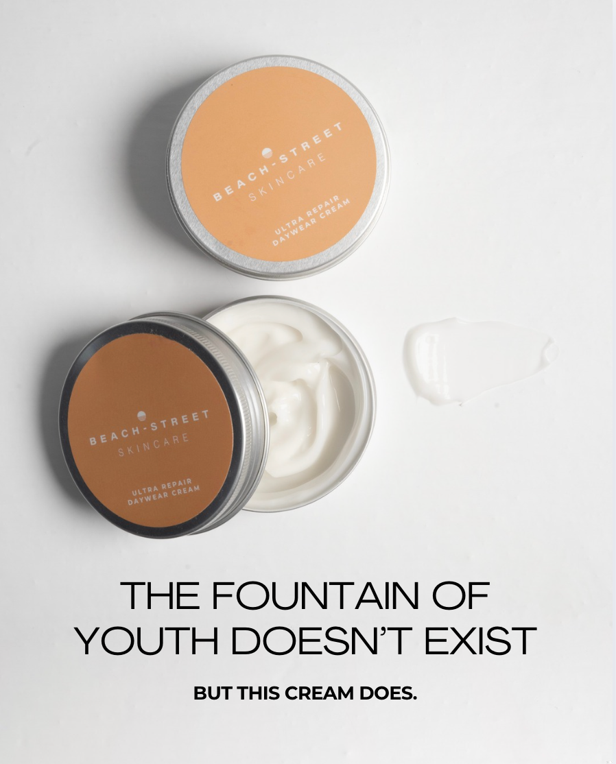
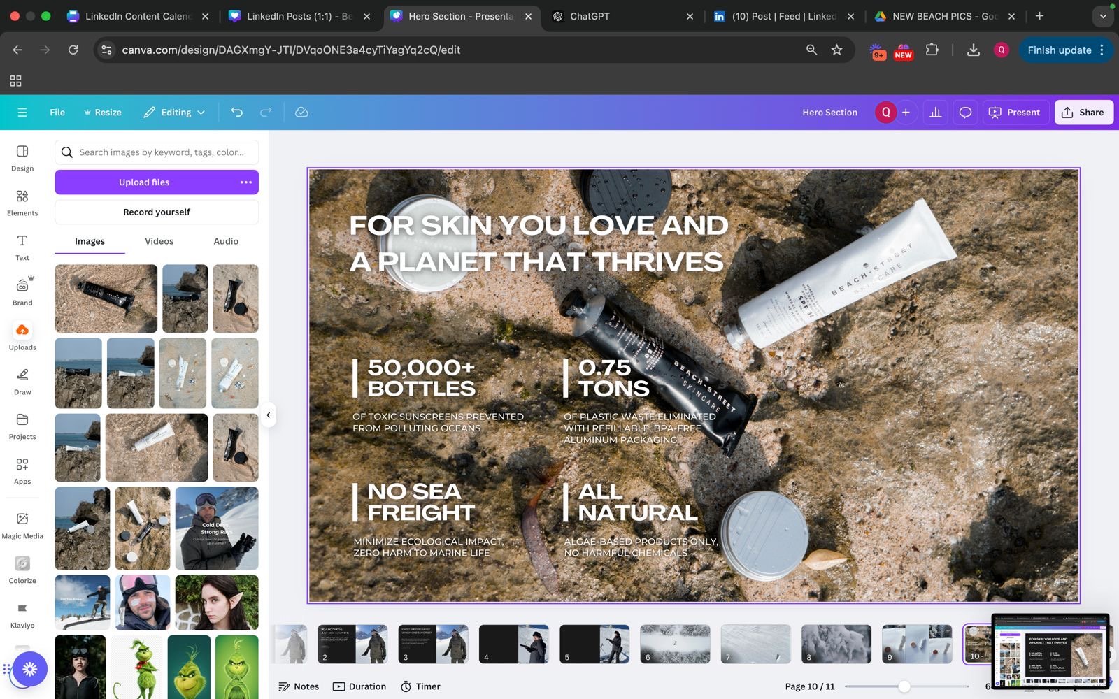
A high-performing email design built to replace outdated templates with a clear story flow, strong product education, and conversion-focused layout. This redesign significantly improved engagement and supported multiple product push campaigns.
Description
Overview
I designed a new email campaign layout for Beach-Street to replace previous newsletter styles that lacked structure, clarity, and conversion flow. The goal was to create a modern, elevated template that could communicate product benefits effectively, reinforce brand identity, and drive sales for specific product pushes.
This new design became the standard for several campaigns, including versions for our mineral sunscreen (hero product).
The Challenge
The existing email templates did not communicate the product’s value or narrative in a clear way. Important information was hidden, the visual flow felt disjointed, and the call-to-action was not emphasized.
We needed an email design that:
• holds attention
• educates quickly
• tells a compelling story
• showcases ingredients and benefits
• builds credibility
• drives conversions
• and supports ongoing promotional campaigns
The challenge was creating a layout that balanced education, emotion, and clear CTAs while staying true to Beach-Street’s clean, ocean-inspired aesthetic.
My Approach
I conceptualized and designed a completely new email format built around a structured storytelling path.
Key enhancements I introduced:
• A strong, benefit-led hero section (“Glow Like You Just Had a Facial”) to immediately hook readers
• Ingredient spotlight modules with clean visuals and concise copy to educate without overwhelming
• High-quality lifestyle imagery to create emotional connection and brand affinity
• Testimonial section placed strategically to reinforce trust at mid-scroll
• Clear CTAs throughout the email to guide purchase decisions
• A timed incentive near the end to lift last-minute conversions
• Brand-consistent textures, color palette, and typography to modernize the visual identity
• Logical flow from awareness → education → proof → offer → purchase
This layout was designed with mobile behavior in mind since the majority of Beach-Street’s audience opens emails on smartphones.
Results
The redesigned email outperformed previous formats across multiple metrics and became the preferred structure for future product campaigns.
Performance highlights:
• Higher open-to-click conversion
• Noticeable improvement in time spent reading
• Increased click-through rate
• Stronger add-to-cart behavior compared to older templates
• Positive internal feedback from both the marketing and PR teams
• Effective for product push campaigns, including sunscreen, where variations of this design were reused
The visual clarity, modern structure, and benefit-driven flow helped the brand communicate product value in a way that felt premium, trustworthy, and easy to digest.
Additional Note
Although this example showcases a different product, the same strategic framework and visual approach were applied to sunscreen variations, each adapted based on campaign goals and seasonal focus.

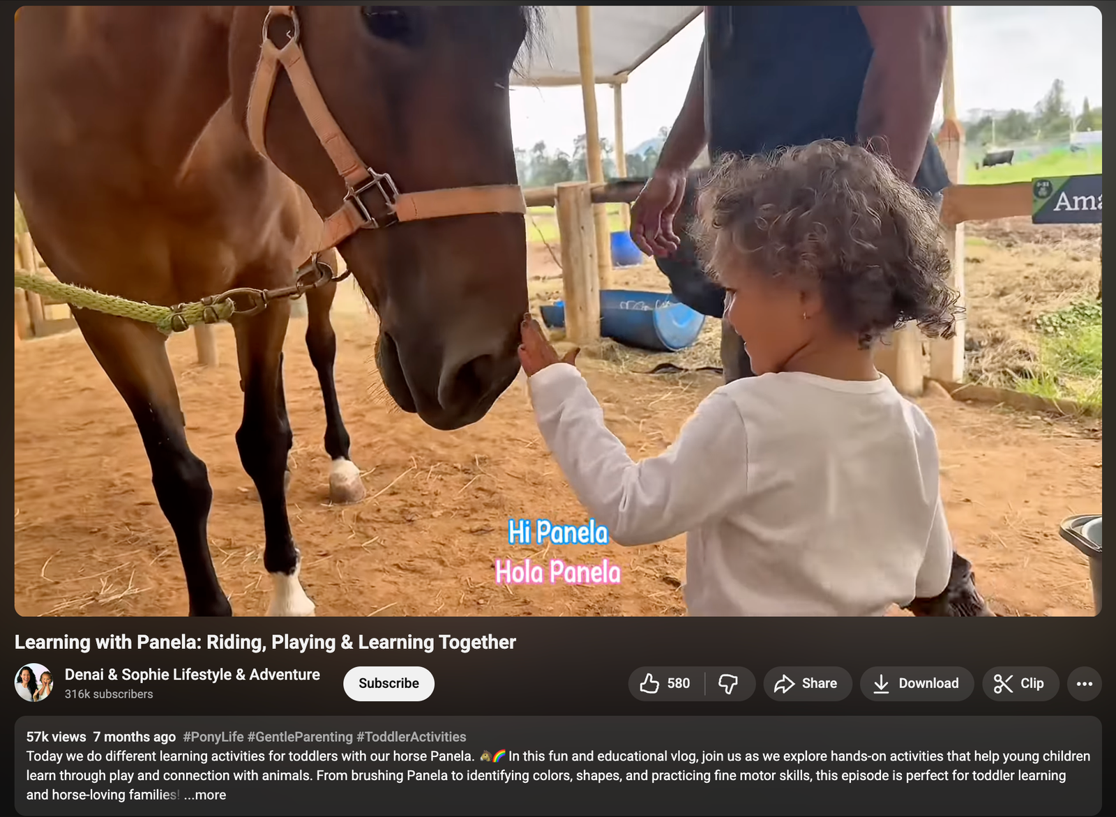
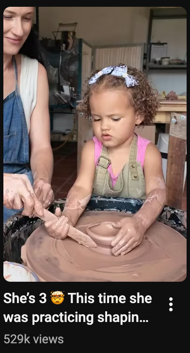
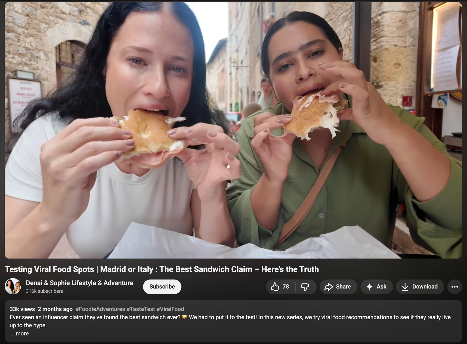
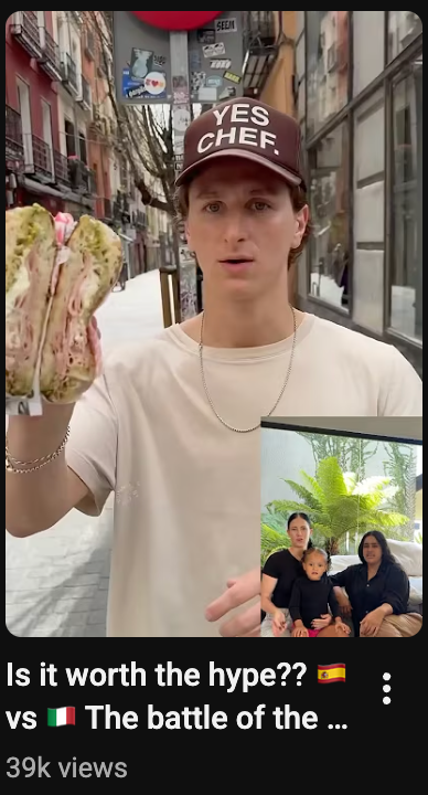
Video Strategy & Editing
Ideated and edited multiple high-performing reels and long form videos, shaping the tempo, visual style, storytelling flow, and engagement strategy. These videos generated thousands of views and became part of the channel’s content formula.
Description
Funnel Strategy, Landing Page Creation, UX Direction, Messaging, Conversion Optimization
Overview
I directed a new landing page for Beach-Street’s mineral sunscreen that served as the primary destination for paid advertising funnels. The page was designed to convert cold and warm ad traffic by explaining the ocean-safe difference quickly and clearly, while establishing trust through strong sustainability storytelling.
The Challenge
Paid ads drive fast but fragmented traffic. Users often decide within seconds whether to stay, scroll, or leave. The challenge was to create a landing page that captured interest immediately, educated efficiently, and guided visitors toward purchase without overwhelming them.
The page had to support performance metrics crucial to advertising such as conversion rate, add-to-cart behavior, scroll depth, and bounce rate.
My Approach
I built the landing page entirely from scratch with a conversion-first structure tailored for ad traffic. The content hierarchy was crafted around how users consume information when entering through paid ads: fast, visual, benefit-led.
Key elements I conceptualized include:
• A problem-solution hero section addressing chemical sunscreen harm and introducing the ocean-safe alternative
• Quick, visual ingredient comparisons to simplify complex topics for fast-scrolling users
• A benefits-first product breakdown emphasizing performance, usability, and formulation safety
• Strong trust signals including press mentions, reviews, certifications, and conservation partners
• Sustainability-led storytelling grounded in Beach-Street’s 100 percent sustainable process
• Lifestyle visuals connecting the product to athletes, divers, surfers, and eco-conscious consumers
• Repeated CTAs to support conversion across different intent levels
• Ad-friendly UX with fast load time, clean layout, and minimal friction
Description
My
Gallery
I am a professional Digital Marketer with experience working with clients from various industries — from small businesses, national brands, to global companies. My focus is helping businesses grow through data-driven, efficient, and result-oriented digital strategies.